
How to create an image of a retro travel poster, and share prompts
If you want to create an image of a retro travel poster that feels collectible instead of generic, the key is not a single magic prompt. You need a style system: era cues, color logic, simplified geometry, and controlled texture. Once that system is clear, you can create an image of a retro travel poster for different destinations without losing visual consistency, then polish layout fidelity with image to image ai.
Most weak outputs fail for one reason: the prompt asks for vintage mood but gives no composition rules. Great retro posters are specific. They use limited palettes, strong foreground silhouettes, clear horizon lines, and one iconic landmark. This guide shows exactly how to create an image of a retro travel poster with reusable prompt blocks, including how to use image to image ai when you already have a rough sketch or photo base.
What makes retro posters look authentic
Retro posters look intentional because they reduce complexity. To create an image of a retro travel poster that reads instantly, build around these visual traits.
Landmark-first composition
Pick one hero element: a tower, bridge, station, mountain ridge, or old harbor. Keep supporting elements secondary. This structure is common in classic retro posters because it guides the eye in one sweep.
Flat color blocks plus subtle print texture
Use 4 to 7 dominant colors. Too many gradients make the output look modern and plastic. Better retro posters combine flat shapes with light grain, halftone dots, or paper texture.
Era-specific palette choices
For 1930s-1950s style, try muted cream, sun-faded red, navy, and teal. For 1960s-inspired retro posters, try warmer oranges, cyan accents, and stronger contrast. Palette controls matter as much as subject choice.
Simplified perspective
Avoid fisheye drama and extreme depth effects. A moderate perspective with clean geometry is easier to read and feels closer to printed travel art.
Prompt framework to create an image of a retro travel poster
Use this five-block framework every time you create an image of a retro travel poster.
Block 1: Subject and place
State destination and hero scene clearly.
- Destination and landmark
- Time of day
- Weather mood
Block 2: Retro style definition
Lock visual era and print behavior.
- Decade influence (1930s, 1950s, 1960s)
- Flat graphic illustration
- Mild grain or halftone paper texture
Block 3: Composition constraints
Prevent chaotic layouts.
- Vertical or wide framing
- Foreground/midground/background separation
- One focal point and limited secondary objects
Block 4: Color direction
Guide color before detail.
- 4-7 color palette
- Warm or cool bias
- Contrast level
Block 5: Negative constraints
Clean up the output.
- No readable letters or numbers
- No modern ads, logos, or UI overlays
- No photoreal skin or glossy 3D rendering
When you create an image of a retro travel poster with these five blocks, your results are easier to iterate and match across a full series of retro posters.
Prompt library: ready prompts you can adapt
Below are practical templates you can paste and modify. Each one is designed to create an image of a retro travel poster while keeping the style coherent.
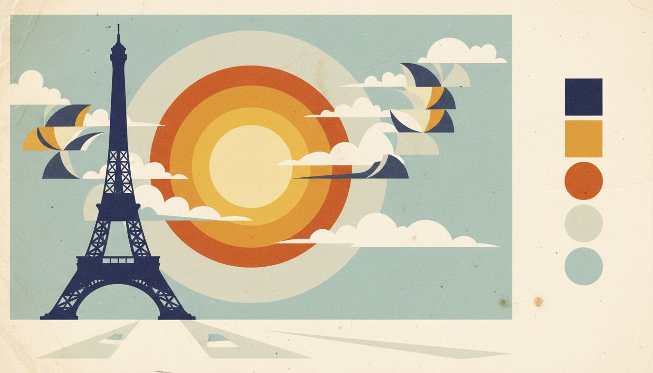
Prompt 1: Paris sunset classic
Create an image of a retro travel poster of Paris, Eiffel Tower as the hero silhouette, warm sunset sky, limited palette of cream, rust red, deep blue, flat graphic illustration, subtle paper grain, clean horizon line, simplified architecture, no readable text.
Prompt 2: Tokyo mid-century skyline
Create an image of a retro travel poster featuring Tokyo skyline in a 1960s print style, geometric cloud shapes, tram in foreground, cyan and orange palette, bold shadow planes, halftone texture, no readable text.
Prompt 3: New York art deco mood
Create an image of a retro travel poster of New York with art deco influence, Chrysler Building silhouette, strong vertical rhythm, muted gold and navy palette, flat shading, print-like grain, no readable text.
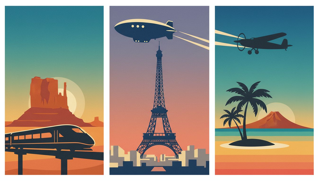
Prompt 4: Coastal rail journey
Create an image of a retro travel poster showing an ocean-side train route, cliff curves, sea mist, 1950s tourism illustration style, reduced detail, teal and cream dominant colors, matte paper texture, no readable text.
Prompt 5: Alpine route morning light
Create an image of a retro travel poster of alpine mountains and a winding road, sunrise glow, pine silhouettes, simplified forms, 4-color palette, slightly faded ink look, no readable text.
Prompt 6: Desert national park
Create an image of a retro travel poster for a desert canyon viewpoint, layered rock forms, long shadows, dusty orange and turquoise palette, posterized illustration, gentle grain, no readable text.
Comparison: text-to-image vs image to image ai for retro posters
If your goal is speed, text-only prompting is enough to create an image of a retro travel poster quickly. If your goal is precise structure, image to image ai often wins. In production pipelines, image to image ai is usually the control layer after creative exploration.
Approach A: text-to-image
Pros:
- Fast exploration of many destinations
- Good for discovering palette and mood options
- Minimal setup
Cons:
- Landmark placement can drift between iterations
- Harder to keep consistent structure across a campaign
- More retries needed when composition matters
Approach B: image to image ai
Pros:
- Keeps your base sketch, map outline, or photo geometry
- Better control over horizon, focal point, and scale
- Easier to produce a coherent set of retro posters
Cons:
- Needs a decent base image
- Too much strength can wash out retro style
- Too little strength can look under-stylized
Use text-to-image for discovery, then switch to image to image ai for production consistency.
Two mini-cases when you create an image of a retro travel poster
Case 1: Independent travel blogger building a destination series
Goal: publish six hero images with one consistent visual identity.
First attempt: pure text prompts. The palette looked right, but landmark size changed too much between outputs.
Fix:
- Built one base composition sketch for all cities
- Used image to image ai with moderate transformation strength
- Locked a 6-color palette across all prompts
Result: the creator could create an image of a retro travel poster for each city while keeping a unified series style.
Case 2: Small tour operator preparing seasonal campaign assets
Goal: make landing visuals for spring and autumn routes.
First attempt: detailed prompts with too many scenic objects. Results felt busy and modern.
Fix:
- Reduced each scene to one landmark + one transport cue
- Added stricter negative constraints
- Reused a shared retro posters style block in every prompt
Result: cleaner visuals, faster approval cycles, and better recognition across campaign variants.
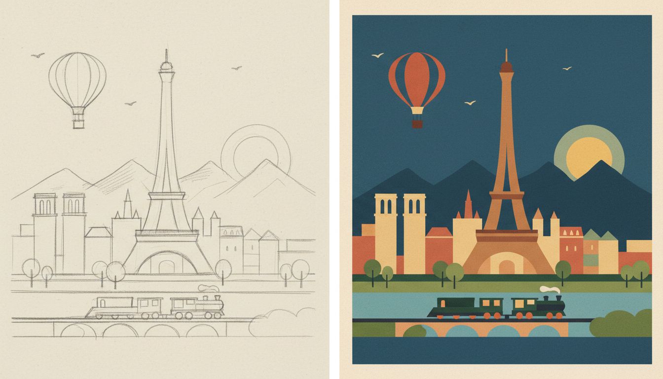
Step-by-step workflow to create an image of a retro travel poster
- Pick one destination and one hero landmark.
- Decide era mood: 1930s, 1950s, or 1960s.
- Define a 4-7 color palette before writing long prompt details.
- Write your five-block prompt template.
- Generate 4-8 text-to-image drafts.
- Select one draft with the clearest silhouette and horizon.
- If composition is unstable, move to image to image ai with a base sketch.
- Tune transformation strength gradually instead of making big jumps.
- Keep texture subtle so retro posters look printed, not noisy.
- Run a final pass with strict no-text constraints.
- Export variants in matching aspect ratios for web placements.
- Save your best prompt blocks as reusable components for future retro posters, including your preferred image to image ai settings.
Common mistakes when you create an image of a retro travel poster
Too many style adjectives
Problem: the model mixes watercolor, photoreal, comic, and 3D cues.
Fix: keep one core style direction and one texture direction.
Weak focal hierarchy
Problem: skyline, vehicle, and foreground compete equally.
Fix: force one hero element and reduce supporting detail.
Over-processed colors
Problem: excessive saturation breaks the vintage feeling of retro posters.
Fix: lower saturation and use one accent color only.
Ignoring image to image ai controls
Problem: unchanged base image or over-stylized output.
Fix: adjust transformation strength in small steps and compare side by side.
Misaligned geometry after stylization
Problem: architecture tilts or landmark proportions drift during image to image ai passes.
Fix: lower image to image ai strength, feed a cleaner base sketch, and keep perspective cues simple.
FAQs about how to create an image of a retro travel poster
What is the fastest way to create an image of a retro travel poster for beginners?
Start with text-to-image using the five-block prompt framework. Once you find a strong style direction, reuse the same structure for new destinations.
Why do my retro posters look modern instead of vintage?
Most likely your palette is too glossy and your details are too dense. Reduce the color count, simplify perspective, and add subtle print texture.
When should I use image to image ai instead of text-only prompts?
Use image to image ai when you need consistent layout across many outputs, or when a sketch already defines landmark placement.
How many prompt iterations should I expect?
Plan at least two rounds: exploration and refinement. For campaign work, three rounds are common: exploration, structure lock, and final polish.
Can I create an image of a retro travel poster without adding text labels?
Yes. You can make the scene self-explanatory through landmark silhouette, transport cues, and atmosphere. This often looks cleaner for modern web banners.
Final CTA
If you want to create an image of a retro travel poster faster, start from one strong landmark concept, apply the five-block framework, and iterate with image to image ai only when composition needs tighter control. Try create an image of a retro travel poster to test variations and keep your best prompt set for future retro posters.